Thursday 13 December 2012

Beyond Thrilled Christmas Card 2012

This year's xmas card is done. Had planned to screenprint it again as I did last year (hence the limited colour palette), but time's overtaking me and I also have a couple of other jobs on, so it's been digitally done. Now to start address-hunting, writing them all out and licking envelopes...

Tuesday 4 December 2012

Illustration & Design for Madison's debut EP


Artwork and design for Madison's forthcoming 5-track EP
I was asked to design the packaging for Scottish band Madison's forthcoming debut EP. Russell from the band forwarded me a sketch of their basic idea which they wanted to illustrate "classic teenage overthinking", and the artwork above is the end result. Pretty pleased with it, as was the band. The EP is due for release next year but you can listen to the tracks here on Soundcloud and there's more info about them on their Facebook page.

Wednesday 3 October 2012

Gig poster design and illustration

Gig poster designed for Fishinasub.com
A random but fun job for Glasgow-based music website Fishinasub.com's forthcoming launch gig, with Halfrican, Mickey 9's and Queen Jane. Always nice to be given free reign, and the client was very happy with the result. Definitely in the game for more quirky little jobs like this.

Tuesday 4 September 2012

New screenprint - Abney Park Cemetery

Screen print of Abney Park Cemetery in Stoke Newington, London N16 - Hackney's first nature reserve. This new open-edition print shows the marble recumbent lion on Frank C Bostock's grave in the foreground, with the derelict chapel in the background. Hopefully this will be the first one of a series featuring London's Magnificent Seven Cemeteries. (London Undertheground, Arf!)

Initially the print will be sold online through my Culture Label and Etsy shops, and in the Abney Park Visitors Centre.

NB. £5 from every sale will go to the Abney Park Trust, who are responsible for the upkeep of the cemetery and nature reserve.

Where next? Highgate, Brompton, West Norwood, Tower Hamlets, Kensal Green, or Nunhead?

Tuesday 7 August 2012

New screenprint - The international language of drinking

Another new screenprint. Something fresh for those amongst you who like a drink. And like to travel. And probably like to drink and travel. How to toast in 11 different languages.

Had some difficulty with registration when I printed this (poor forward planning) which resulted in an uncomfortable number of discarded prints and seconds. But it's best to be perfectionist I think and has resulted in an edition of 14 prints which I'm happy with - nine of them with the gorgeous teal blue and a further five with a lovely green instead - a detail from which is below.


If anyone's interested in procuring one of these fine prints, they'll be on sale in my online shops very soon...

Thursday 26 April 2012

New screenprint - Smiling Chicken Head

A new print! I've recently had to spend some time reprinting my "No Underground. Get Over It" open edition screenprints as they're selling so well, but I also found time to print this one. Much bigger than my previous prints - and my first purely CMYK screen print - this is an image that's been rolling around my brain and sketchbook for a while now. I'm particularly pleased with the chicken's toothy grin. 

It's printed (as always) using permanent water-based inks, on 300gsm Somerset paper with a deckle on each edge and measuring 22"x30". It's a very small edition of 10 and will be shipped to customers in a sturdy cardboard tube, and will be available shortly via my Culture Label and Etsy online shops.


Tuesday 27 March 2012

Beyond Thrilled at the V&A Museum


Very pleased indeed to announce that two of my "No Underground. Get Over It" screen prints are now available via the V&A Museum Shop - both the physical one and their online one. They selected the Crystal Palace and London Fields prints to be included as part of their Spring Summer 2012 Collection.

The V&A is an amazing museum and has long been a favourite of mine. I'll definitely be dropping by soon to see their British Design exhibition, which runs from March 31st to August 12th

Tuesday 28 February 2012

Illustration Friday w/e 2/3/2012 - Capable

Another Illustration Friday contribution, this time illustrating the word "Capable". Something which in handyman terms I'm very much not. This drawing kind of reprises some sketches I did a few years ago on the theme of "My part in the war against inanimate objects", and shows my admiration and envy for "handy" heroes who wield power tools with confidence and can fix and build stuff without it falling apart. Still, most of them can't draw for toffee. Anyway, as always any comments or criticism is welcomed, thanks.

Tuesday 14 February 2012

New Beyond Thrilled shop on Culture Label

Beyond Thrilled now has a presence on the fantastic CultureLabel.com website!


In their own words, "Think of us as your creative department store; we curate the very best product from our arts partners’ shops and designers’ collections, then bring them together for you to browse and buy. The price you pay with us is the same as if you go direct to our partners’ individual sites – the only difference is the ability to buy from all 200 in one basket.

Every single sale on CultureLabel.com helps to support some of the greatest arts and heritage organisations, of all sizes, in all kinds of places, directly funding a brilliant range of innovative work."

Wednesday 8 February 2012

Illustration Friday w/e 10/2/2012 - Suspense

Another quick Illustration Friday effort, this time on the given theme of "Suspense". I think the subject matter's a little too obvious, so I've tried to give it quite a dynamic composition (think German expressionist films, ha!) using shadow cast by the TV's light, but with a limited 3 colour cartoon palette. As always, any comments, constructive criticism and/or feedback is welcome, thanks.

Tuesday 31 January 2012

Illustration Friday w/e 3/2/2012 - Forward


Been busy screenprinting so I haven't managed to produce an illustration for IF for the past couple of weeks, but here's this week's illustration of the word/theme "Forward" - Don Quixote galloping forward across the plains of La Mancha astride a slightly tubby Rocinante. (Sancho Panza's running along behind just outside the frame...)

Monday 16 January 2012

Screenprint - Visit Alexandra Palace by motor-bus service no W3


Screen print - Visit Alexandra Palace by motor-bus service no. W3. No Underground. Get over it.

Another new screenprint in my ongoing series of screen prints in the style of London Transport's glorious posters of years past, featuring a few of London's off-underground and oft-overlooked neighbourhoods.

An open edition, hand printed on white Fabriano 5 "Liscia" paper. Paper size 300x400mm, image size approx. 250x360mm

CLICK HERE TO BUY FROM THE BEYOND THRILLED ONLINE SHOP

Screenprint - Visit Crystal Palace

Screen print - Visit Crystal Palace by regular railway and motor-bus services. No Underground. Get over it.

Another new hand pulled screenprint in my ongoing series of screen prints in the style of London Transport's glorious posters of years past, featuring a few of London's off-underground and oft-overlooked neighbourhoods.

An open edition, hand printed on white Fabriano 5 "Liscia" paper. Paper size 300x400mm, image size approx. 250x360mm

CLICK HERE TO BUY FROM THE BEYOND THRILLED ONLINE SHOP

Tuesday 10 January 2012

Illustration Friday w/e 13/1/2012 - Grounded

Okay, another submission for Illustration Friday, this week on the theme of "Grounded". Definitely something 1950's about this one with the blocks and slabs of pure colour. I'm also working on a couple of new screenprints so that's probably influenced the colour overlaps. Anyway, for once I've managed to create something that approaches the original image I had in mind. As always, any feedback and comments appreciated, thanks.

Tuesday 3 January 2012

Illustration Friday w/e 6/1/2012 - Highlight

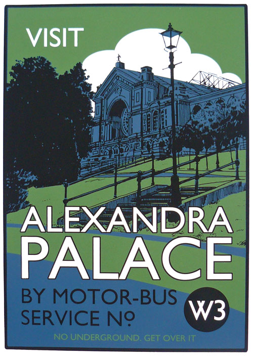
So, here's my first Illustration Friday of 2012. I'm planning to produce something pretty much every week this year in an attempt to build up a decent illustration portfolio - with a view to perhaps getting some freelance illustration work.

The given word/theme this week was "Highlight", a word which conjures up images of bad 80's hair or Stabilo highlighter pens, neither of which I really fancied illustrating. So I approached it by a slightly oblique route in the picture above - using the word highlight in the sense of pointing something out. Any feedback appreciated as ever, thanks!

 *** UPDATED ***
I wasn't totally happy with the colouring of the version above, so have been tinkering around and thought I'd also upload these two alternative versions which I think I prefer, as they have more muted colours and a slightly '50s feel. Let me know which you prefer, thanks!

Ronald Searle - 3 March 1920 – 30 December 2011

Ronald Searle died a few days ago on 30th December 2011. I saw the 2010 exhibition of his work at the Cartoon Museum - which marked his 90th birthday, and the exhibition catalogue is already well-thumbed on my studio bookshelf. The exhibition did justice to the vast range of his work, from very early drawings through the drawings he produced while a POW working on the infamous Thai-Burma railway, to his best known work as the creator of St Trinians and the Molesworth/Down with Skool books he produced with Geoffrey Willans. His drawings were genuinely inspiring - I particularly loved the pen-and-ink reportage work he produced in the 50s in his "People Worth Meeting" and "Looking at London" series, as well as the more obviously humorous drawings he produced during his visits to the US, and he was clearly a man who loved to draw. The exhibition was justly titled "Ronald Searle - Graphic Master" - I'm not sure anyone else has ever imbued such beautiful line drawings with so much humanity and humour - and his influence on many great illustrators is undeniable. RIP.